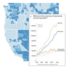
Poverty rates, income, and wealth are some of the most tracked statistics for the nation’s economy. Between 2015 and 2016, the the national median household income rose by 3.2 percent and the official poverty rate dropped by 0.8 percent. However, changes in poverty varied greatly across the country.
Using data from the U.S. Census Bureau’s American Community Survey, Headwaters Economics mapped counties with significant changes in the percent of families in poverty between 2010 and 2015.1 While poverty in the country as a whole was decreasing, it increased significantly in at least 671 counties—approximately 21 percent of counties in the U.S.
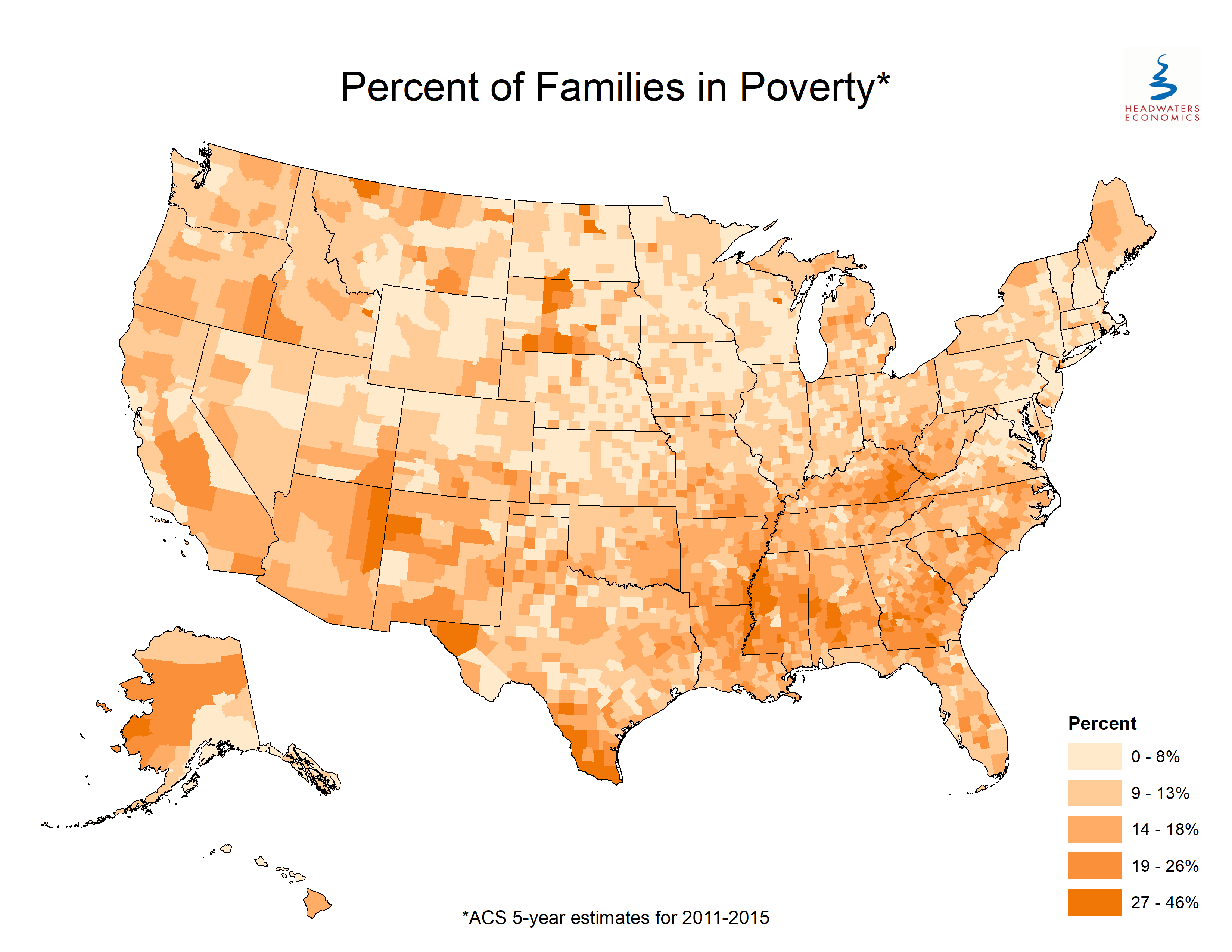
The data visualization above focuses on counties where the share of families in poverty changed by at least five percentage points between 2010 and 2015.2 (A static map below shows the percent of families for every county.)
Fifty-nine counties saw a significant decrease (green dots) and 146 saw a significant increase (purple dots) in the percentage of families in poverty, where the change in percentage points was at least five.
A focus on national poverty rates can mask more nuanced local trends that can be important for local decision makers to understand.
Georgia and southwest Texas are good examples of places that require further investigation. Twenty-four counties in Georgia had an increase in the percent of families in poverty of at least five percentage points, more counties than any other state, while only three counties in Georgia had decreases in poverty of the same magnitude. On the other hand, families in some counties in southwest Texas appear to be climbing out of poverty.
The American Community Survey data has a margin of error. Use Headwaters Economics’ online tool, Populations-at-Risk, to explore socioeconomic data and details for each U.S. county, or different levels of geography ranging from whole states to individual U.S. Census tracts.